JC Penney: a mobile and desktop experience from a customer perspective.
A JC Penney Critique
Usually I pay my bills on time, but occassionally, I miss a payment. This is the JC Penney scenario I will explore, question, and solve with a more smoother, non-irritating customer experience. Or did some JCP designer's ears burn? You'll see what I mean.
Role
Foremost as a JCP customer and very irritatingly later, a UX Designer.
Responsibilities
- better userflows & interaction design
- a much better customer (me) experience, at least in this sample project
Devices
- mobile & desktop
Scenario
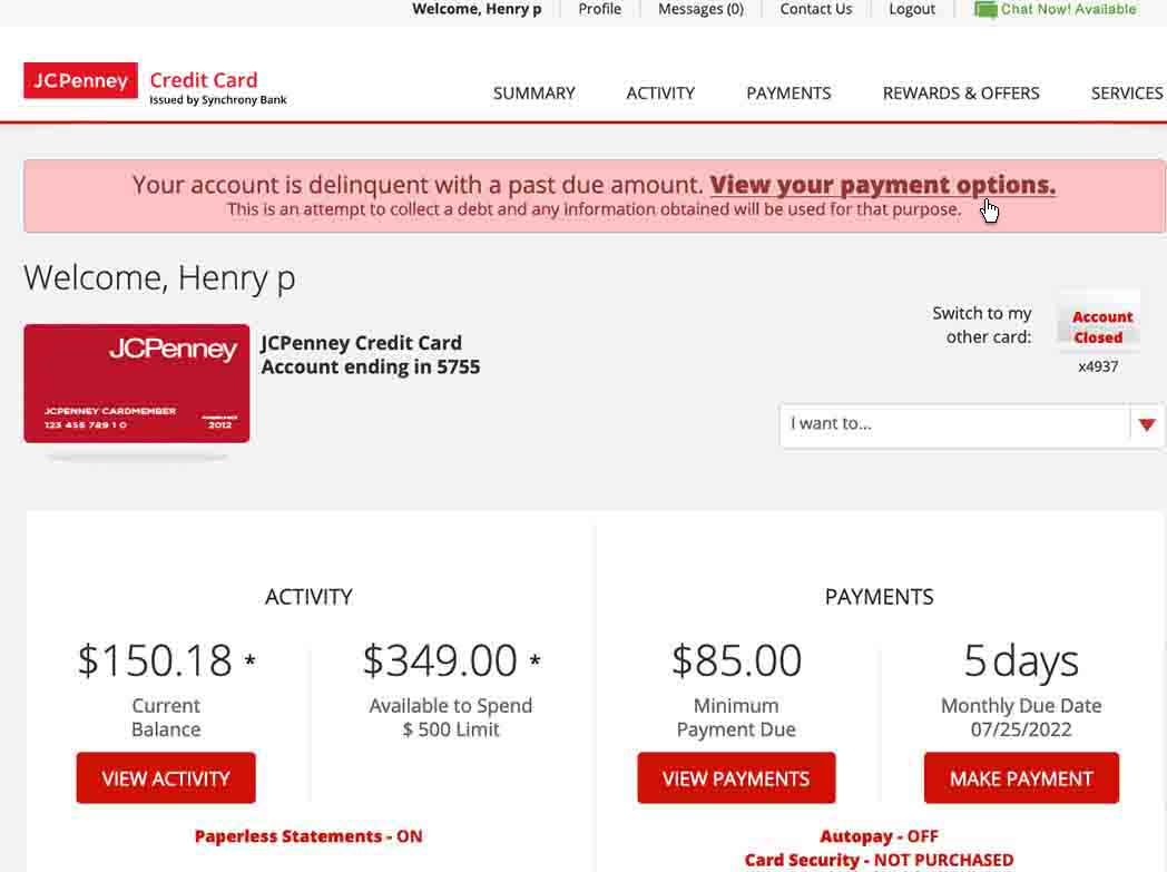
A little more explanation regarding my payment scenario: On desktop, I thought I paid my JCP bill, but the desktop experience gave me no indication that I made a payment except for a blank screen. Truly puzzled that I paid my bill or not, I initially looked for a confirmation payment email. No email.
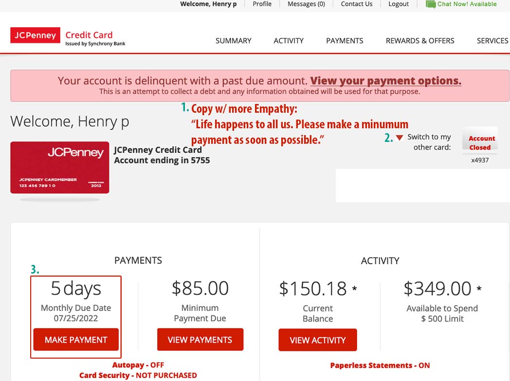
I thought of a couple UI options:1) the after UI below and 2) a modal that temporarily stops the customer from their flow which in this case is to make an immmediate payment. A $85 deliquency doesn't warrant this modal option or does it? (Got usability study!). Now, if the deliquency amount was much more and several months behind, then possibly a modal would warrant this option. Payment delinquency rules goverming comppanies may prove option 2 nonsensical instead authorizing a debt collection agency. A educated yet unknowing asuumption on my part.
Given my delinquent account and JCP's immediate payment requirement, give the customer the first opportunity to make a payment hence my rearranging of the UI.
Because I started with the JCP desktop experience to make a payment, below screenshots are desktop userflows as I experienced it. Mobile userflows proceed with highlighted differences.
JCP Account Summary (Before)
JCP Account Summary (After)
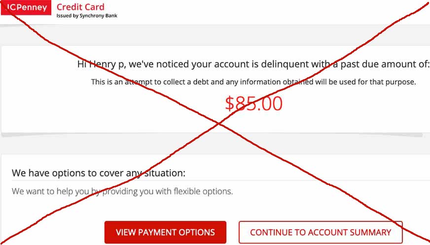
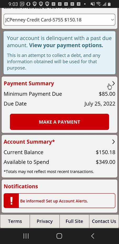
JCP Delinquent screen
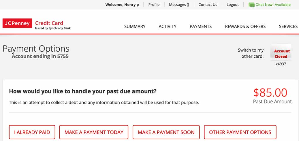
JCP Payment Options
Why is the Delinquent screen in the flow!? Instead jump to the Payment Options screen. Based on JCP's concern over my delinquency, they decided on repeated exclamations to make there point making a bad customer experience.
JCP Payment (above the fold)
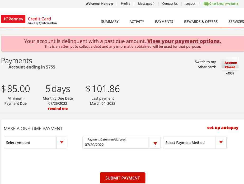
JCP Payment Summary (below the fold)
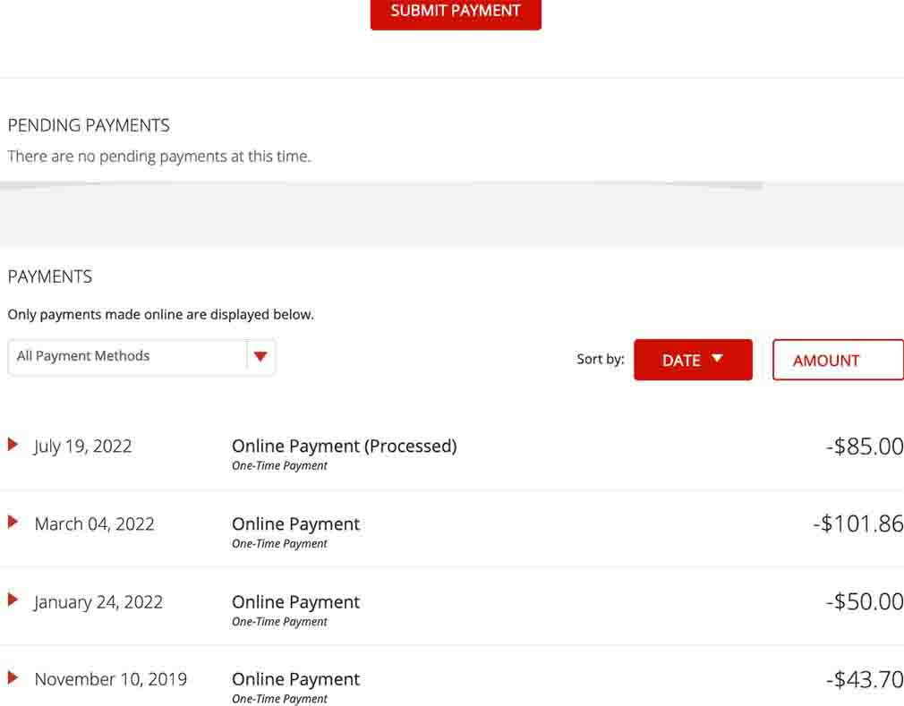
As I stated at the beginning, I thought I made a payment, but got no indication that I did. No positve acknowledgement. No email payment verification. Nothing. The Account Payment below the fold screen (above) was many minutes later. Then, I went to JCP mobile to verify that I made a payment or not.
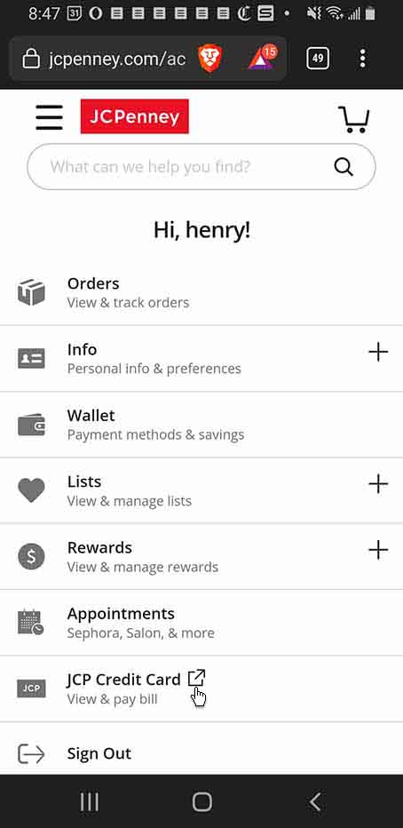
The JCP mobile was markedly better due to their "Pay as Guest" option and traditional login and password flows. JCP's mobile flows have changed during my initial JCP critique (Was a designer watching and/or listening!?). Since my second attempt, I'll briefly detail what has transpired and the differences between my initial and second reviews.
To underscore my quest to verify my payment or not was all consuming. Through discovery, I found out about these flows and features.
Home from JCP.com
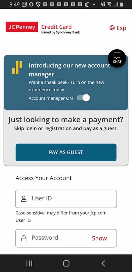
JCP Guest Login
Forgot I had another closed acct.
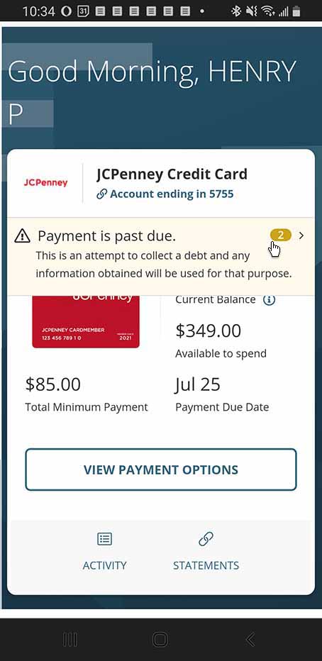
JCP Payment Overview
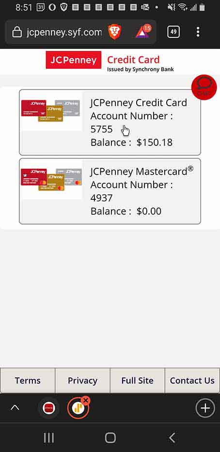
JCP Account Overview
Payment Summary
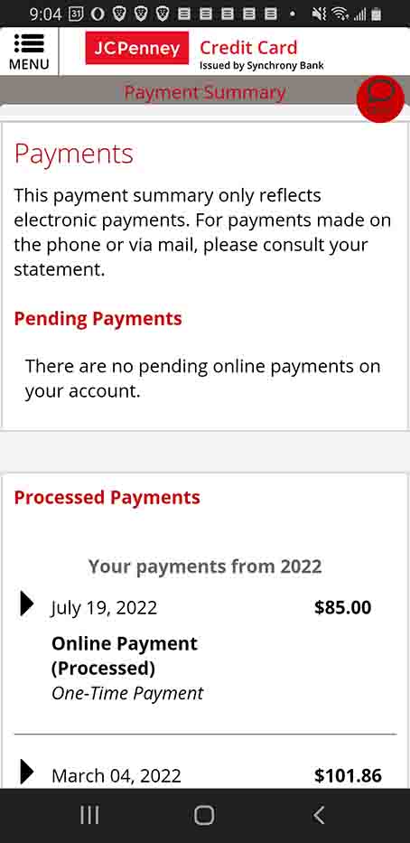
I noticed the "badge" in the JCP Payment Overview screen and tapped it. It didn't make sense to make another payment instead I tapped the Payment Summary. Mostly relieved, I saw that my payment was "processed". Probsbly, JCP's backend had a hiccup. From the time I thought I paid my bill to the Payment Summary screen was more than 15 minutes. This occured on July, 25, 2022.
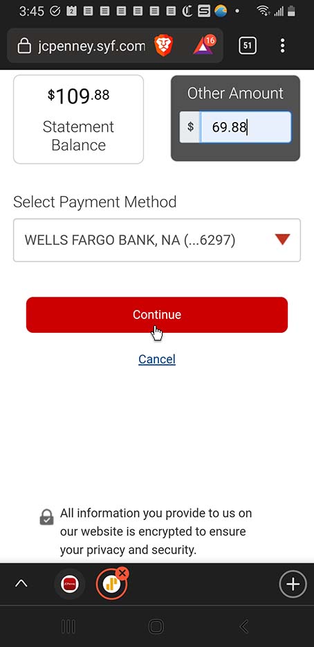
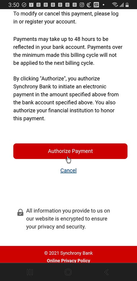
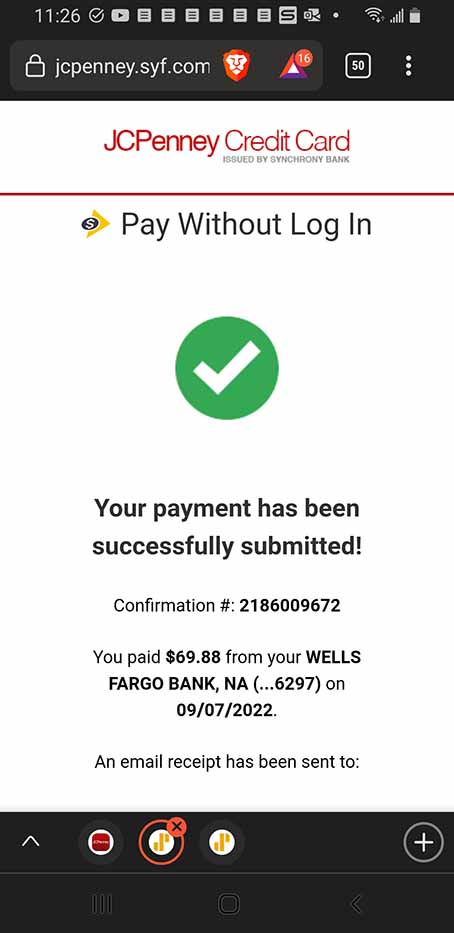
A few months go by. I noticed a late fee on my September bill for $40 totalling $109.88. I called customer service and pleaded the exorbitant fee though I was rightfully late. To be honest, I sporadically use my JCP account hence my lack of attention. The understanding woman waives the late fee. And, I wanted to try the Guest login flow. Below are these flows with a UX resolution that acknowledges my payment. Why didn't this happen in July!?
Better late than never, I guess?!.
Pay as Guest

Payment Amount
Authorize Payment

Authorize Payment
Payment Paid
Lessons Learned
No app is perfect, but it could be better. Maybe JCP hired some new UX Designers between July and September because the mobile customer experience got better as I first invisioned it and no backend hiccups.